Add a Trendline in Excel
This example teaches you how to add a trendline to a chart in Excel.
1. Select the chart.
2. Click the + button on the right side of the chart, click the arrow next to Trendline and then click More Options.

The Format Trendline pane appears.
3. Choose a Trend/Regression type. Click Linear.
4. Specify the number of periods to include in the forecast. Type 3 in the Forward box.
5. Check "Display Equation on chart" and "Display R-squared value on chart".

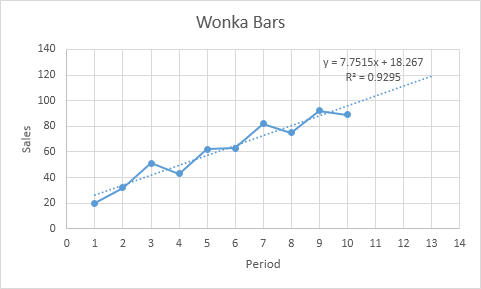
Result:

Explanation: Excel uses the method of least squares to find a line that best fits the points. The R-squared value equals 0.9295, which is a good fit. The closer to 1, the better the line fits the data. The trendline predicts that 120 Wonka bars will be sold in period 13. You can verify this by using the equation. y = 7.7515 * 13 + 18.267 = 119.0365.
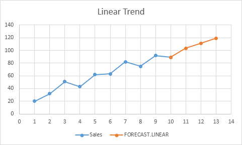
6. Instead of using this equation, you can use the FORECAST.LINEAR function in Excel. This function predicts the same future values.

7. The FORECAST.ETS function in Excel predicts a future value using Exponential Triple Smoothing, which takes into account seasonality.

Tip: visit our page about forecasting to learn more about these functions.